
A generative brand system designed to scale healthier outcomes
The Challenge
CareEvolution's solutions enable healthcare organizations to give patients access to their information simply, securely, and, efficiently across different systems, devices and providers. After 20 years of steady and strategic growth, the time had come to expand their story—so their technology could support the changing healthcare landscape in ways that no one else can.
As the company shifted from custom solutions to self-service products, they needed a brand that would help their users understand how their products work together and the wide array of use cases they serve. But CareEvolution’s radically flat org structure—a feature of their success in innovation—required a design system that anyone could work with, whether they’re a software architect, data scientist, or a PhD in molecular biology.
The Solution
CareEvolution’s products give researchers and clinicians the ability to extract insights from divergent and disconnected data sources. Their new identity expresses that value in a logo that connects fragments into a unified symbol.
The brand kit of parts lives in Figma, as components and templates with seemingly infinite combinations, but all programmed to stay within the confines of the brand and GTM strategy. Every file is ready to use, adapt, and combine into new outputs, empowering the CareEvolution team to design branded materials with consistency, but without feeling confining as new opportunities emerge. This allows the team to save time and resources while maintaining a strong and cohesive brand identity. And it helps to foster a culture of creativity and innovation that is true to CareEvolution’s values.
The Outputs
-
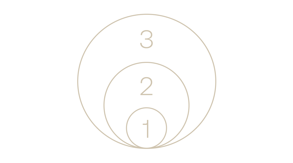
1. Active Brand Purpose
CareEvolution’s products give researchers and developers the power to make smarter decisions as they work with and build healthcares systems. The new brand purpose, “Connecting people to shape healthier futures”, expands their role from making data usable, to turning information into an accelerant for positive change.
-
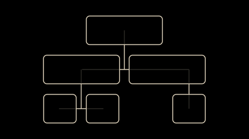
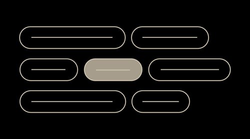
2. Brand Architecture
To better serve a more diverse set of users, we helped CareEvolution organize their products by customer use cases, making the value of their offerings more clear to any audience.
-
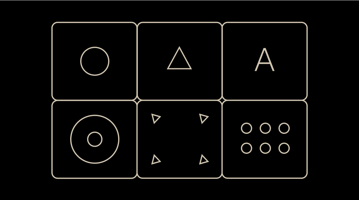
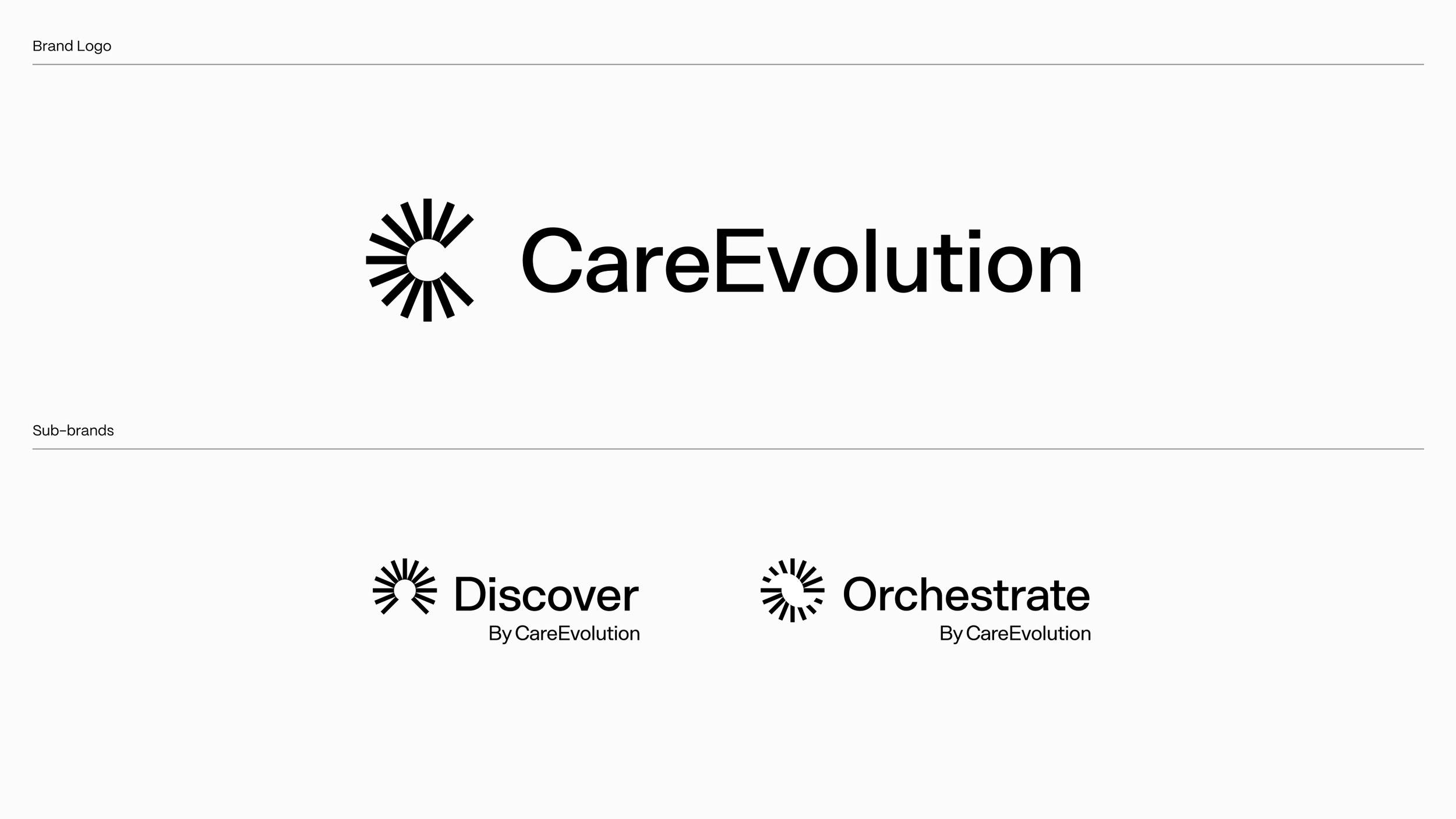
3. Brand Identity and Toolkit
The new symbol—a dial that forms a C—is used as both an identifier and an interface, connecting the brand with the behaviors of building and adapting systems that can positively reshape healthcare for everyone.
-
4. Verbal Toolkit
CareEvolution has a unique way of expressing that allows them to cut through industry jargon just by being themselves. So the brand toolkit includes a voice that codifies their way of speaking so any team member can write comms, while foundational messaging guidance helps them all stay in lock step on how they describe the value of what they build.
-
5. Launch Assets
Social media marketing assets were crafted to support the brand launch and provide guidance on future partnership promotion, including templated sales collateral to arm the CareEvolution team with branded materials to support new business efforts.
-
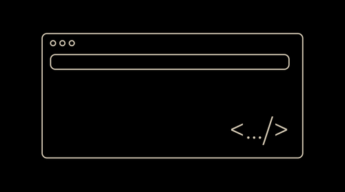
6. Website Design and Development
The website was redesigned—from wireframes and content strategy to UI and visual design—to ensure it reflects CareEvolution’s story, heritage and deep expertise while introducing the new go-to-market plan to the world.
The Design
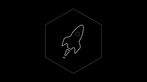
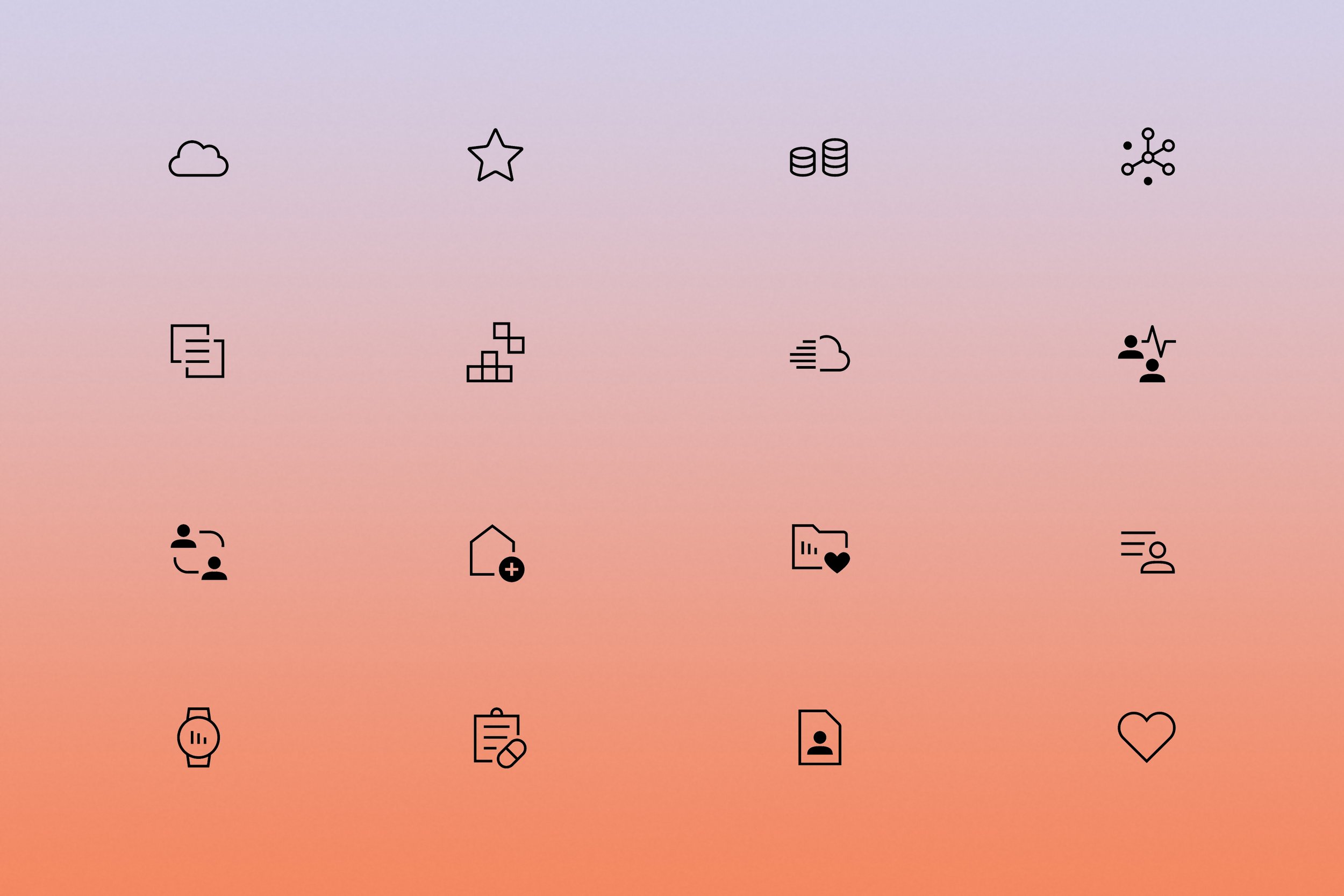
Iconography

Brand behaviors
Motion Dashboard
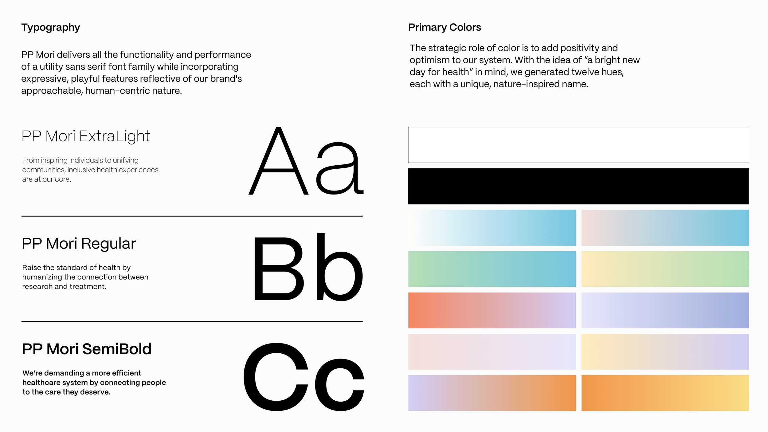
The color palette is how we differentiated CareEvolution from a sea of sameness in healthcare. Linear gradient color pairings were carefully selected to create a blend of 12 unique hues that represent CareEvolution’s optimistic outlook on the future of healthcare. The colors are inspired by the sun, the sky, and the earth—bringing humanness to their technology.
The Color Gradient System
The Brand Playbook and Activation
The brand playbook is a living document that helps the CareEvolution team flex their brand over time. It gives guidance and examples of typography, photography, messaging, and more. Ensuring they can create their own assets at the pace they need, without an internal design team.
Brand playbook

Dial Components
Employee Cards
Gradient Backgrounds
Presentation Template
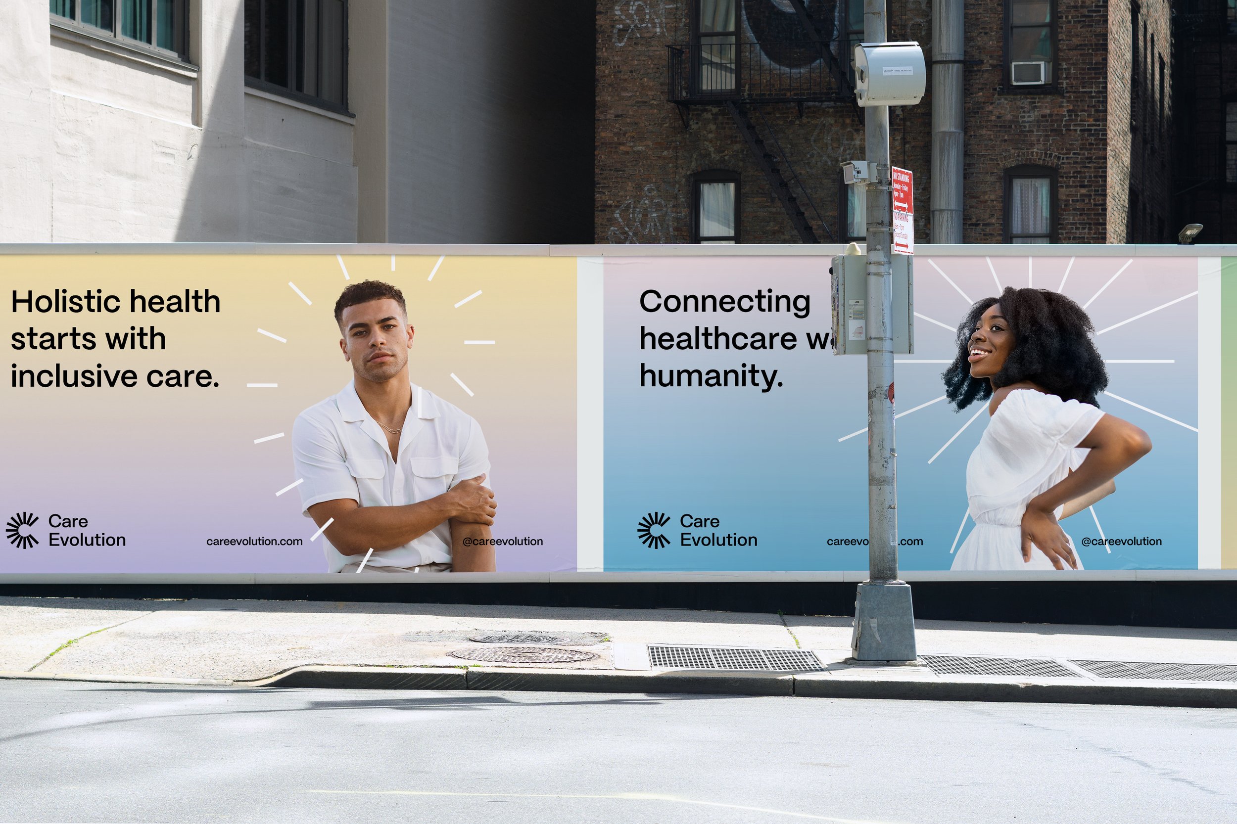
Brand Touchpoints
A library of launch-ready assets was created to ensure CareEvolution could swiftly launch the new brand into the world. Assets included swag, marketing collateral, digital business cards, and sales enablement material.


Our approach to the website redesign was strategic and agile to ensure we could help CareEvolution launch their new brand in time for a fast-approaching conference. We worked collaboratively with their team to design wireframes, work through content strategy, co-write copy, and apply the identity system to the site. Our sprint-based, integrated approach allowed the design work to be iterative so we could test the design system and make it stronger as we went. Check it out at careevolution.com.
Website redesign and build
“Working with Proto has been an epiphany, one that I think will be enduring -- you have changed how we think about ‘brand’. Your facilitation and methodical approach was absolutely critical in getting us to be able to find and express our voice. Your ability to extract that from us and then share back how that may manifest in verbal, color, image, typography, and other design is just awesome!”
- Vik Kheterpal, Principal